CSS animations are really awesome, they're smooth, and requires less coding than javascript or flash. and now, all browsers support CSS3 transitions and animations.
In this tutorial we'll take advantage of theses new wonderful Css3 features and capabilities, we'll add a smooth background animation and a nice tilting/zooming effect to any div and its contents on mouse hover.
Here's what the final result looks like :
Cool CSS Zooming and Tilting Effect
It's pure CSS3!
Yes It Is.
Pushing the web forward.
Cool CSS Zooming and Tilting Effect

This Picture is awesome
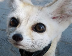
This Picture is awesome
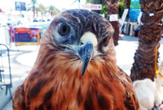
Here's another picture
yes, It's awesome too
The background animation runs continuously and the Zooming / spinning effect is triggered by the parent div's mouse hover, Let me show you how it's done!
The CSS :
.dAnim
{
    padding:5px;
    font-family:Georgia,Verdana;
    border:1px solid #bbb;
    display:inline-block;
    position:relative;

    /* on Mouseout animation */
    /* The -webkit- and -ms- vendor prefixes are added */
    /* for chrome and ie10+ comptability */
    transition: transform .2s ease-out;
    -webkit-transition: -webkit-transform 0.2s ease-out;
    -ms-transition: -ms-transform .2s ease-out;

    transform: scale(1) rotate(0deg);
    -webkit-transform: scale(1) rotate(0deg);
    -ms-transform: scale(1) rotate(0deg);

    /* CSS3 Stripes as a Background Image*/
    background-image: linear-gradient(135deg,#c2c2c2 25%,#dadada 25%,#dadada 50%, #c2c2c2 50%, #c2c2c2 75%,#dadada 75%,#dadada 100%);
    background-image: -moz-linear-gradient(135deg,#c2c2c2 25%,#dadada 25%,#dadada 50%, #c2c2c2 50%, #c2c2c2 75%,#dadada 75%,#dadada 100%);
    background-image: -ms-linear-gradient(135deg,#c2c2c2 25%,#dadada 25%,#dadada 50%, #c2c2c2 50%, #c2c2c2 75%,#dadada 75%,#dadada 100%);
    background-image: -o-linear-gradient(135deg,#c2c2c2 25%,#dadada 25%,#dadada 50%, #c2c2c2 50%, #c2c2c2 75%,#dadada 75%,#dadada 100%);
    background-image: -webkit-gradient(linear, 100% 100%, 0 0,color-stop(.25, #dadada), color-stop(.25, #c2c2c2),color-stop(.5, #c2c2c2),color-stop(.5, #dadada),color-stop(.75, #dadada),color-stop(.75, #c2c2c2),color-stop(1, #c2c2c2));
    background-image: -webkit-linear-gradient(135deg,#c2c2c2 25%,#dadada 25%,#dadada 50%, #c2c2c2 50%, #c2c2c2 75%,#dadada 75%,#dadada 100%);
    background-size: 40px 40px;

    /* Background stripes animation */
    animation: bganim 3s linear 2s infinite;
    -webkit-animation: bganim 3s linear 2s infinite;
    -ms-animation: bganim 3s linear 2s infinite;

    z-index:98;
}

@keyframes bganim { from {background-position:0px;} to { background-position:40px;} }
@-webkit-keyframes bganim { from {background-position:0px;} to { background-position:40px;} }
@-ms-keyframes bganim { from {background-position:0px;} to { background-position:40px;} }

.dAnim:hover
{
    /* The hovered element needs to be the top element */
    z-index:99;

    /* Main div mouseover animation */
    transform: scale(1.3) rotate(2deg);
    -webkit-transform: scale(1.3) rotate(2deg);
    -ms-transform: scale(1.3) rotate(2deg);
}
.dAnim div
{
    border:1px solid transparent;
    background-color:white;

    /* Inside divs mouseout animation */
    transition: transform .2s ease-out;
    -webkit-transition: -webkit-transform .2s ease-out;
    -ms-transition: -ms-transform .2s ease-out;

    transition-delay:.1s;
    -webkit-transition-delay:.1s;
    -ms-transition-delay:.1s;

    transform: rotate(0deg);
    -webkit-transform: rotate(0deg);
    -ms-transform: rotate(0deg);
}
.dAnim:hover div
{
    border:1px solid #444;

    /* Inside divs mouseover animation */
    transform: rotate(-2deg);
    -webkit-transform: rotate(-2deg);
    -ms-transform: rotate(-2deg);
}
The previous Css code will be executed against each div in the DOM elements having a class named "
dAnim". All divs inside that parent div will have a different effect (a tilting in the opposite direction), the way you place the divs will have an effect on the final result, for example if the divs are Nested, they will have a cumulative rotation effect, which means that each div will tilt -2 degree relatively to its parent div. if not the divs will have a homogeneous tilt.
HTML Markup:
<div class="dAnim">
    <div>
         <img src="i2.jpg" />
         <div>
             Here's another picture
             <div>
                 yes, It's awesome too
             </div>
         </div>
    </div>
</div>
The above html markup will generate this animation:
Here's another picture
yes, It's awesome too
Check the
Demo Page or download the attached file for more examples.
Note: This technique works on browsers supporting CSS3 (animations and transitions), which all modern browsers do, even IE versions 10+, also It degrades gracefully for older browsers (only the animations will not work).
I'd love to hear your thoughts and ideas, so feel free to comment.
And if you like this tutorial, please Share it.